
Prevented revenue loss and preserved SEO, analytics, and marketing integrity by redefining size-variant architecture and UI
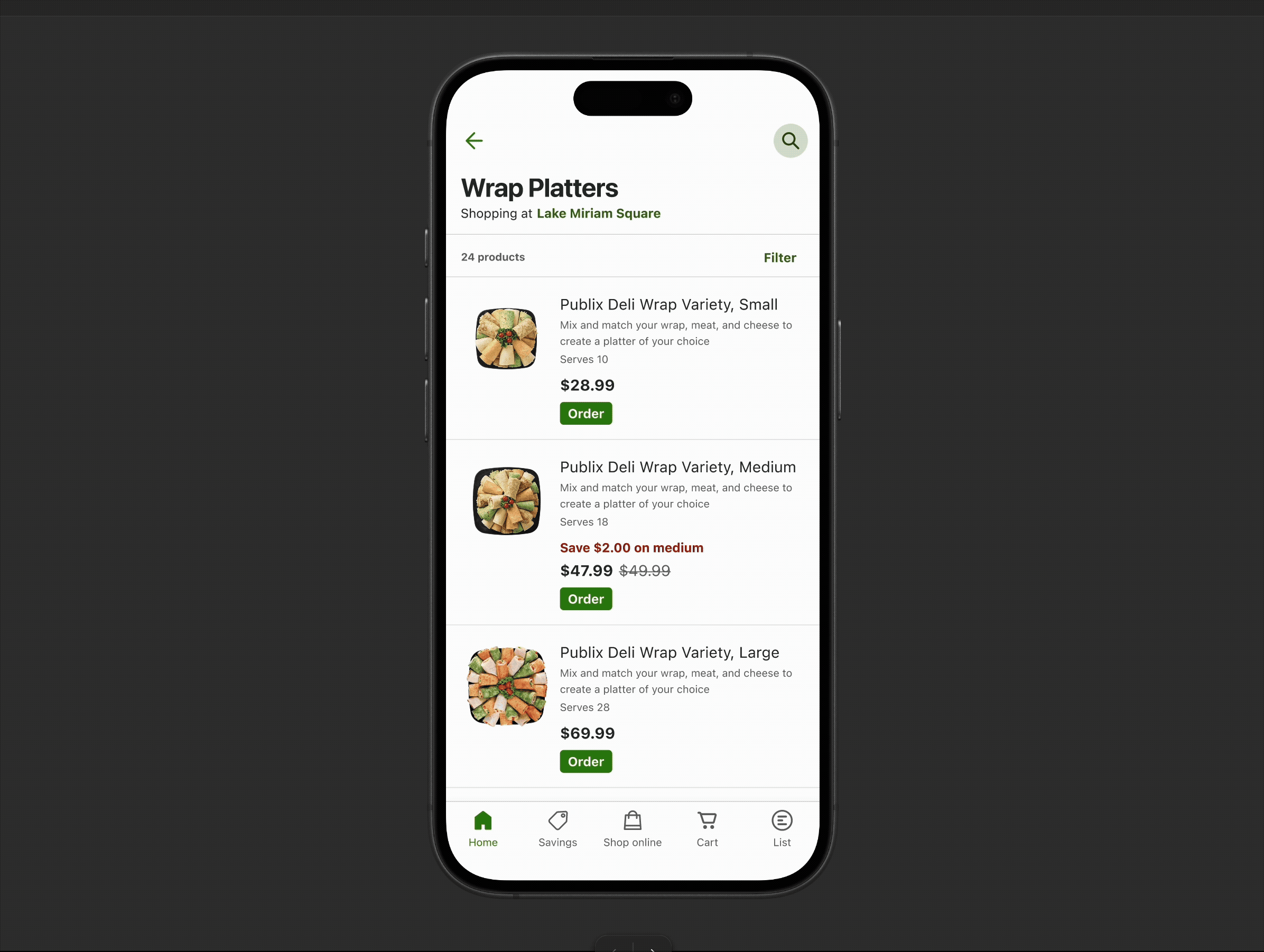
Engineering initiated a test to consolidate size variants (Small, Medium, Large) into a single product card, allowing customers to select size on the PDP instead of navigating separate product pages.
While the concept had clear UX potential—reducing redundancy and simplifying browsing—the execution introduced critical issues across both the frontend experience and backend architecture.
Most notably, all size variants were collapsed under a single ProductID, removing unique identifiers for Medium and Large sizes.
What initially appeared to be a UI simplification revealed a much larger problem: the change disrupted core systems supporting SEO, paid media, analytics, and customer navigation, creating significant risk to revenue and platform stability.
Reviewing the test implementation uncovered three critical gaps:
Key Findings
These findings revealed that the problem was not just UI—it was a misalignment between frontend experience, backend architecture, and customer intent.
To address both immediate usability issues and long-term system risks, I proposed a solution that balanced UX clarity with architectural integrity.
This approach ensured we could simplify the experience without compromising the systems that drive revenue and performance.
This project reinforced that small UI changes can have significant system-level consequences.
What initially appeared to be a simple UX improvement surfaced deeper dependencies across analytics, marketing, SEO, and backend architecture.
By addressing both the user experience and underlying system design, we ensured the solution not only improves usability—but also protects and enables long-term business performance.